I’ve never really done any UI stuff, but we needed these for the game and someone had to do it. It started terribly, and feel free to laugh at the initial results, but I had to go through the first ones to end up with the final result. I also enjoy that we are all comfortable sharing ‘bad art’ among the team without felling judged, it’s very important in a creative environment.
The first step was trying to understand how we want these to communicate and the needed variations depending on the player input(e.g. gamepad, keyboard, etc). I started with heavy photo references, a bit all over the place.
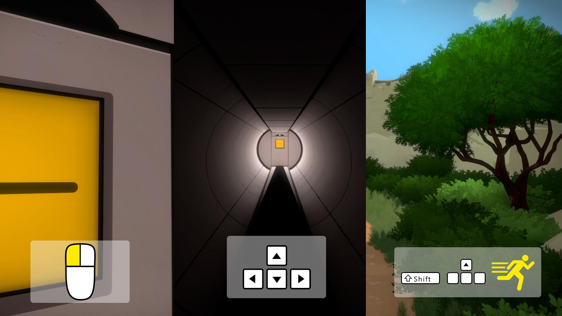
I realized I would have to simplify them since they don’t match the aesthetic of the game, so the research this time was learning how everyone else is doing it. Once I understood the key features, I had a shot at a more stylized version. Here is an attempt with the keyboard/mouse controls:
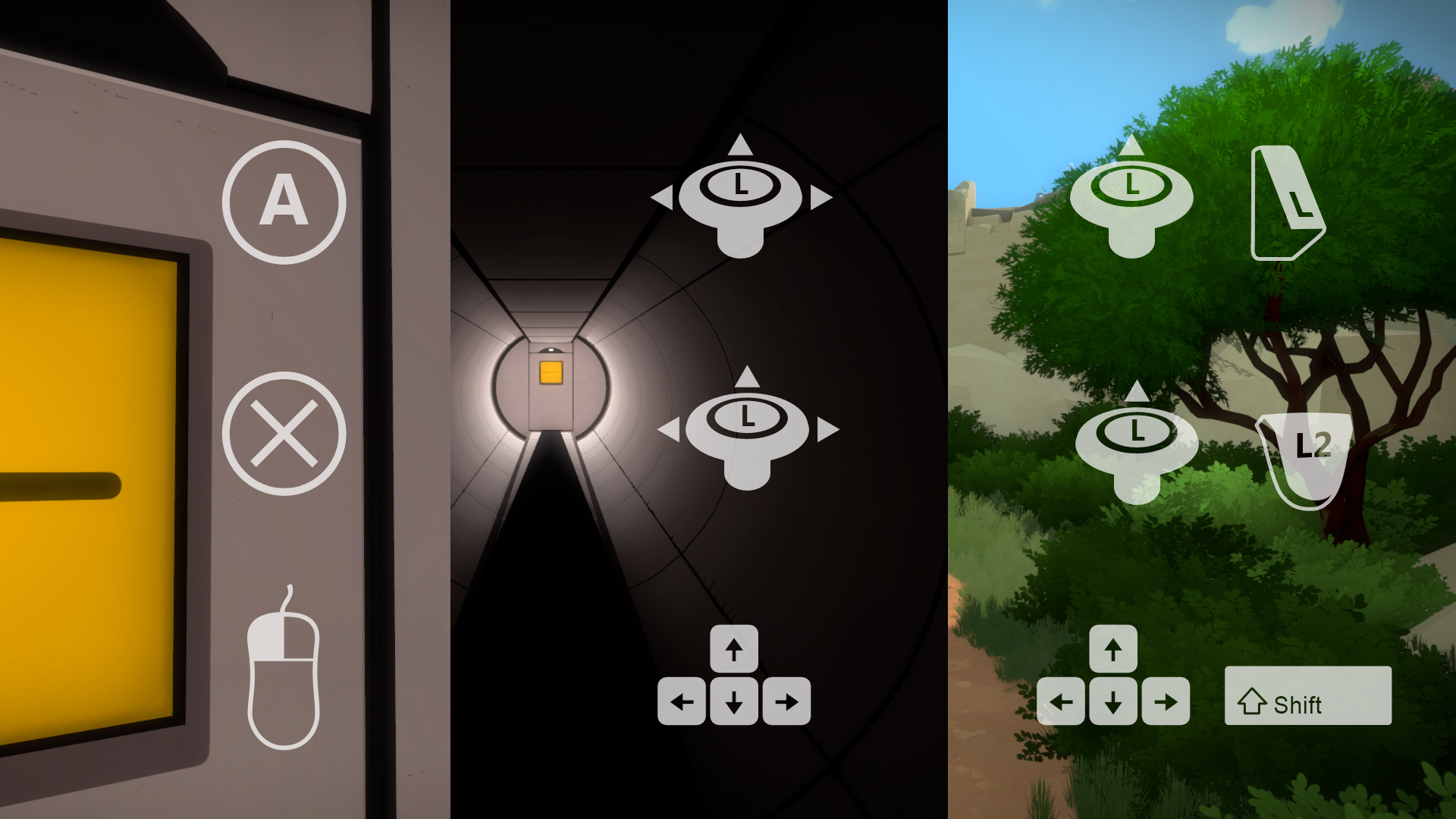
I then tried to apply the same concept to the Playstation controller and ran into more issues. Button pressing vs shoulder trigger vs joystick movement are so different that the symbols had nothing in common. One was a 3D render, another just a flat icon and the others a gradient shape. The colors were also all over the place, from white on PC to black, blue and yellow on Playstation.
The white background was also starting to bother me. I added it so you could read the symbols independently from the brightness of the scene, but it creates a very unbalanced frame.
And then we also have the yellow running man…
I tried a totally different direction, maybe I can make it all sketchy, kinda like the boat map? But since these should be distinct from the game world it was quickly discarded.
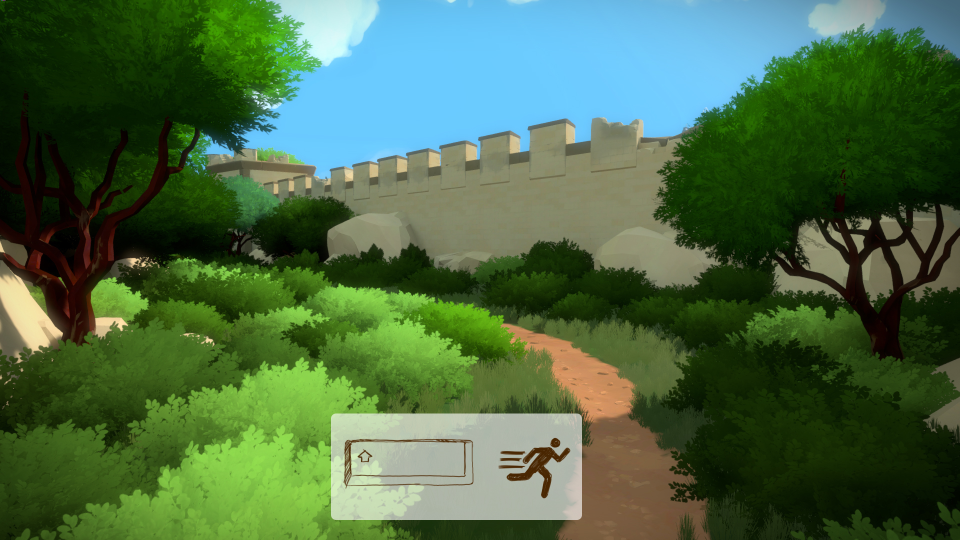
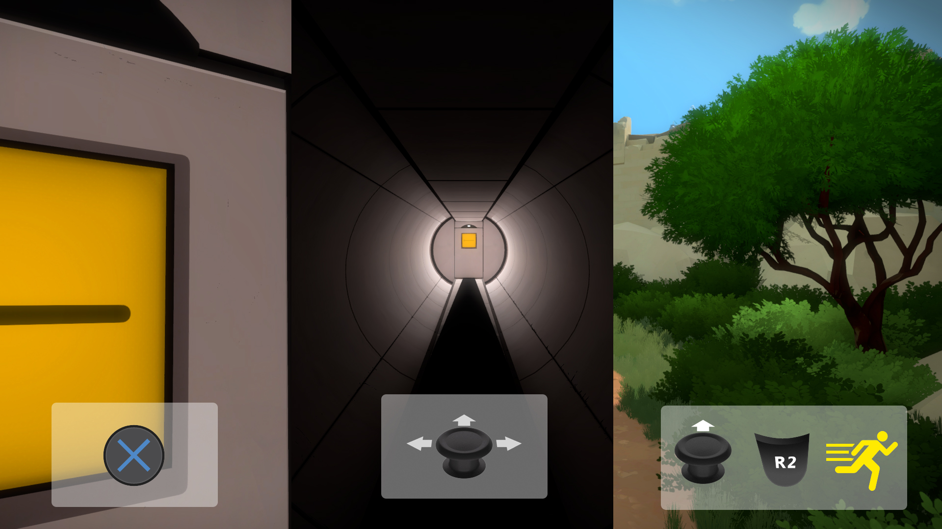
So I went extreme, no more white background, one color and solid shapes, which meant I could switch between 2D and 3D symbols (whatever as more clear for the specific input) and still have a uniform look. Still not quite there yet, but much better than the previous iterations!

Now that I knew this direction worked, I played with the color fill areas to get the most contrast and readability, and we removed the running man (yay!).
The Playstation L2 button was still a bit tricky to get right but I like the final result. I had no idea it would end up looking like this and it was an interesting iterative process.