Easily one of the fondest areas of the game for me, probably because it allowed us to figure out the art style for buildings, and I was responsible for creating the building and everything inside it. It’s a hugely detailed structure and it was a great exercise in using all the knowledge we had learned so far for the project.
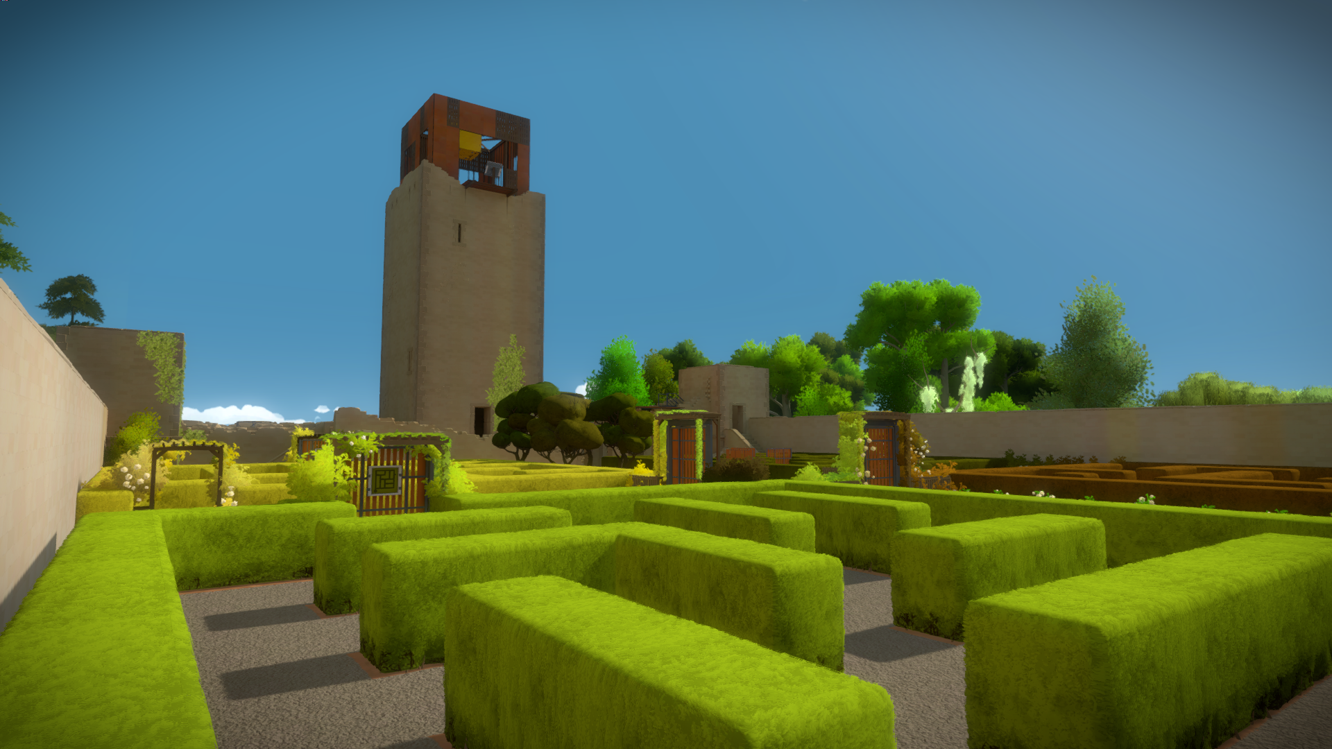
As you can see from this old image, the front maze puzzles were already defined from very early on:
 The architects proposed a look for the building, and there had been a rough pass from a previous artist.
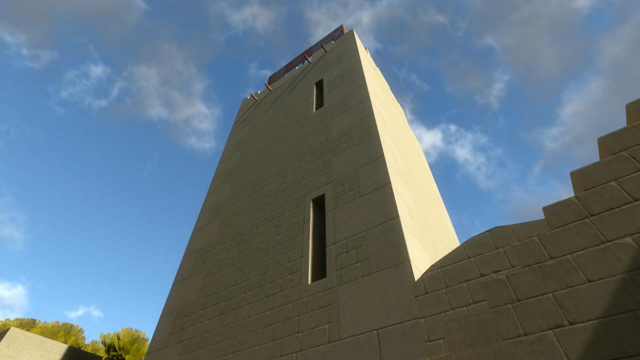
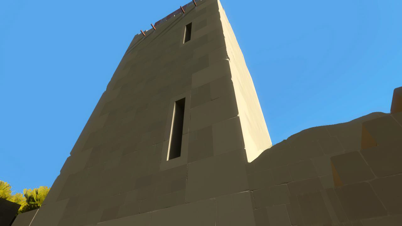
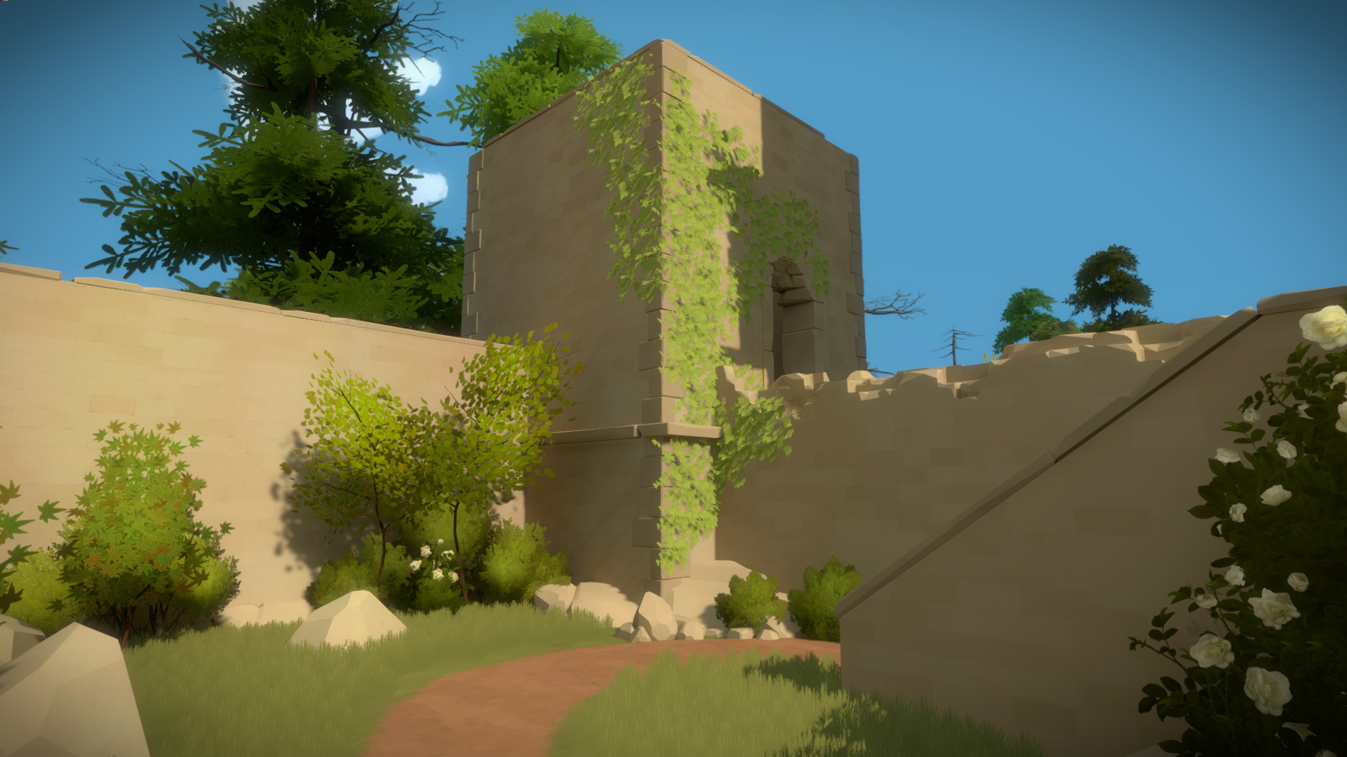
This is how the tower used to look, very close to the current shape, but in terms of architectural details and textures, pretty off:

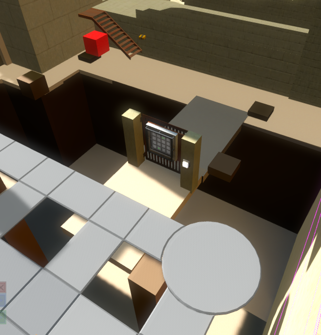
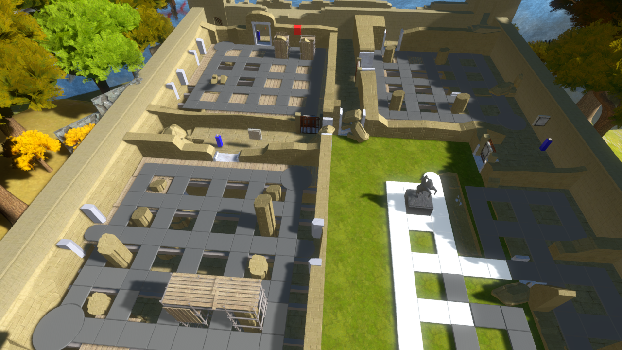
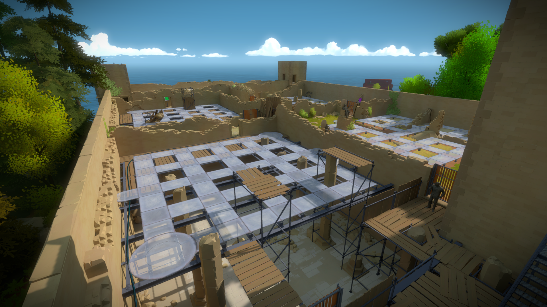
The back of the keep, even tough the puzzles were defined, was still mostly mockup slabs:
Figuring the art style
The first step was trying to figure out how we wanted the principles of the art direction to apply to the environment. To figure this out I started from a in-game screenshot, since it’s the fastest to iterate from:
I did a paint over to test my theories. Since the shapes are so simple, we need detail on the corners to show what the building is made off (in this case the chipped bricks). I also removed the noisy sky and cleaned up the texture to something a lot more simplified. It worked well, we still get the important information from the previous screenshot, without all the noise, and get rid of the gamey sharp edges that make it feel like a box.
The next step was to do a practical ingame application of these results, so we can walk around and know how the player will perceive it. I selected a corner in the keep, that was complex enough to tackle the issue, but simple enough to be fast to iterate.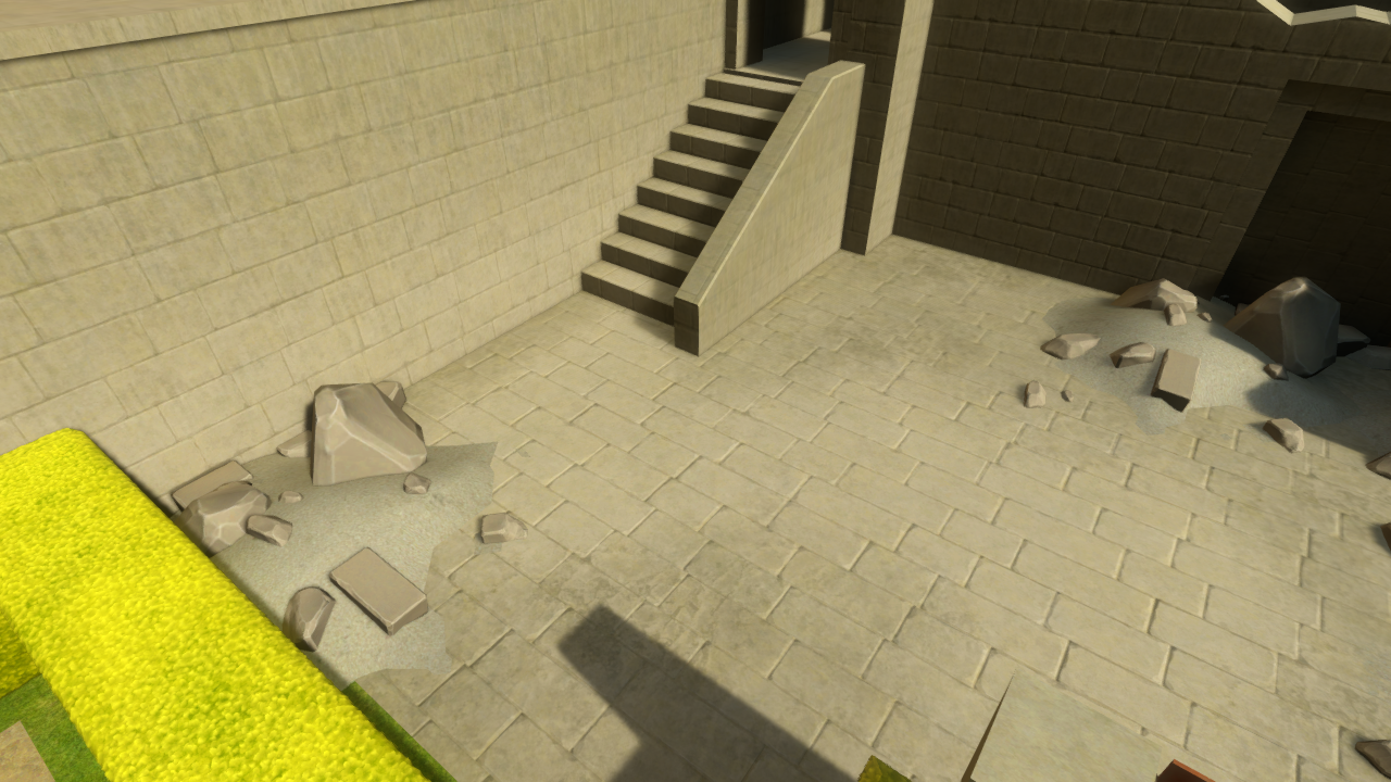
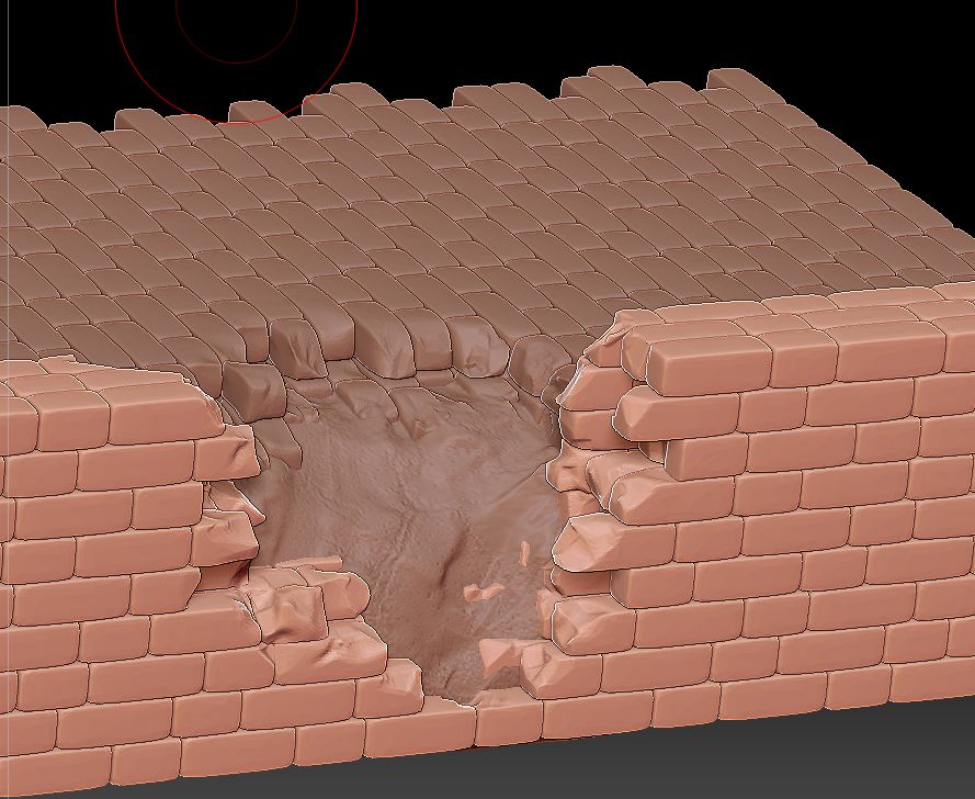
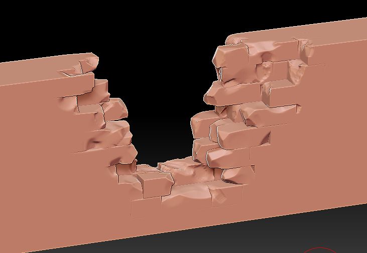
I wanted to figure out how to convey broken walls, since by nature those are very noisy and the Keep would have a lot of them.. I build a set of brick walls and floor and tried to tear them down in ZBrush, matching some real world reference.
 Once I was happy with this, I tried to simplify it, asking myself, what details can I remove without losing any of its properties? Ending up with this:
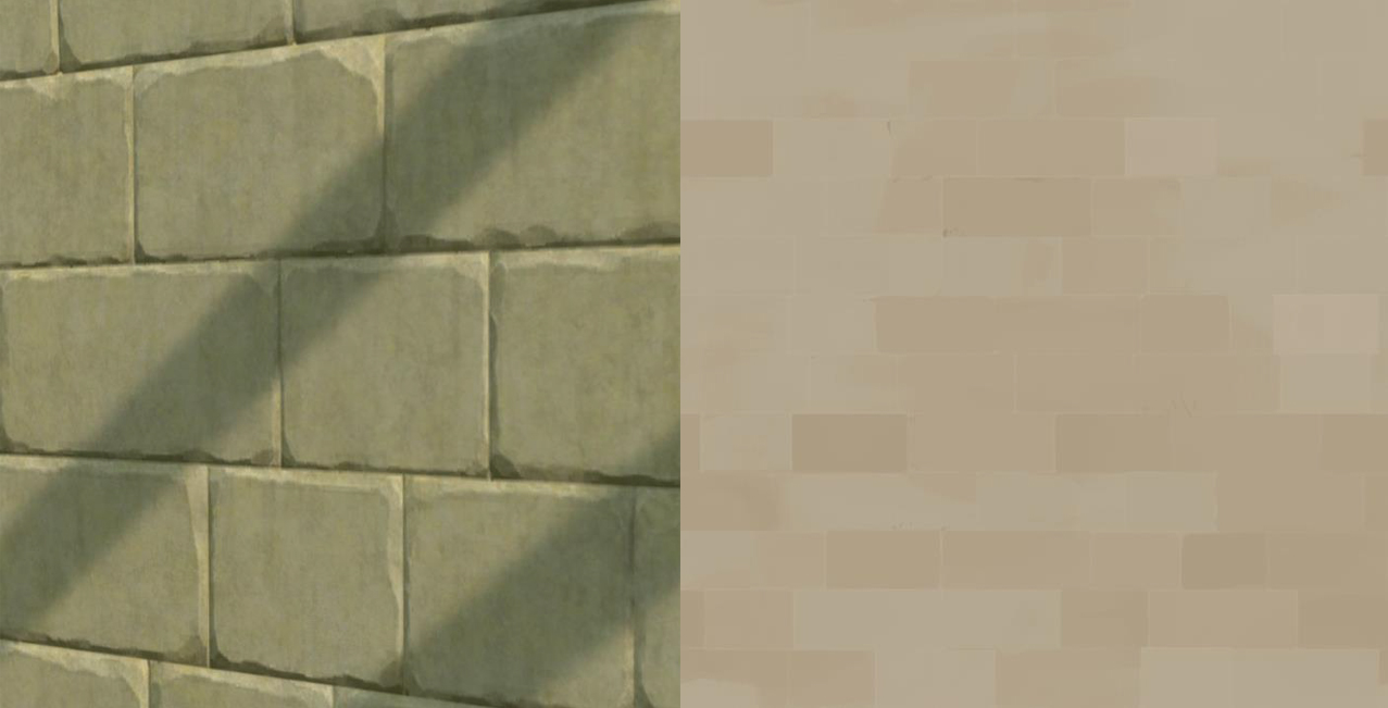
At the same time I was also trying to understand how we could reduce texture detail, keeping the bare minimum to convey how the walls could look like:
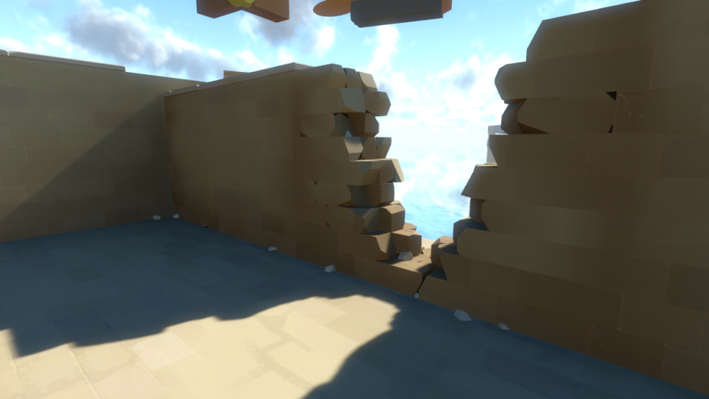
And then applying all these steps to a in game mesh:
It reads nicely and doesn’t feel cartoonish. So I decided to try and apply these principles to the corner, thinking about architecture details and scale, using references and making sure the small details would support the overall shape.
In parallel, I was working with the architects figuring out the design of the building itself. They provided detailed explanations of how the structure used to be, the purpose of each room, the navigation, wall thickness, etc. Once again, priceless details that would have taken me ages to understand.
Since we were happy with the results, I applied these principles to the whole structure. The process ended up being extremely time consuming, cleaning up the meshes from Zbrush, after decimated, so they would have clean geometry. I also wanted to avoid having any repetition on the broken down walls, so there wasn’t much modularity in the ruins
Here is an example of the many cases, where I had to custom sculpt the bricks. I also wanted to make sure that the bricks matched the texture size, so they would blend seamlessly.
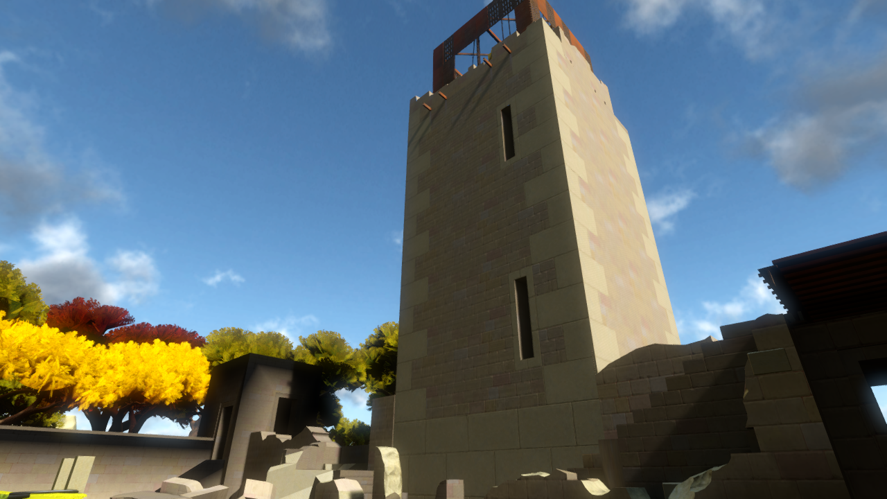
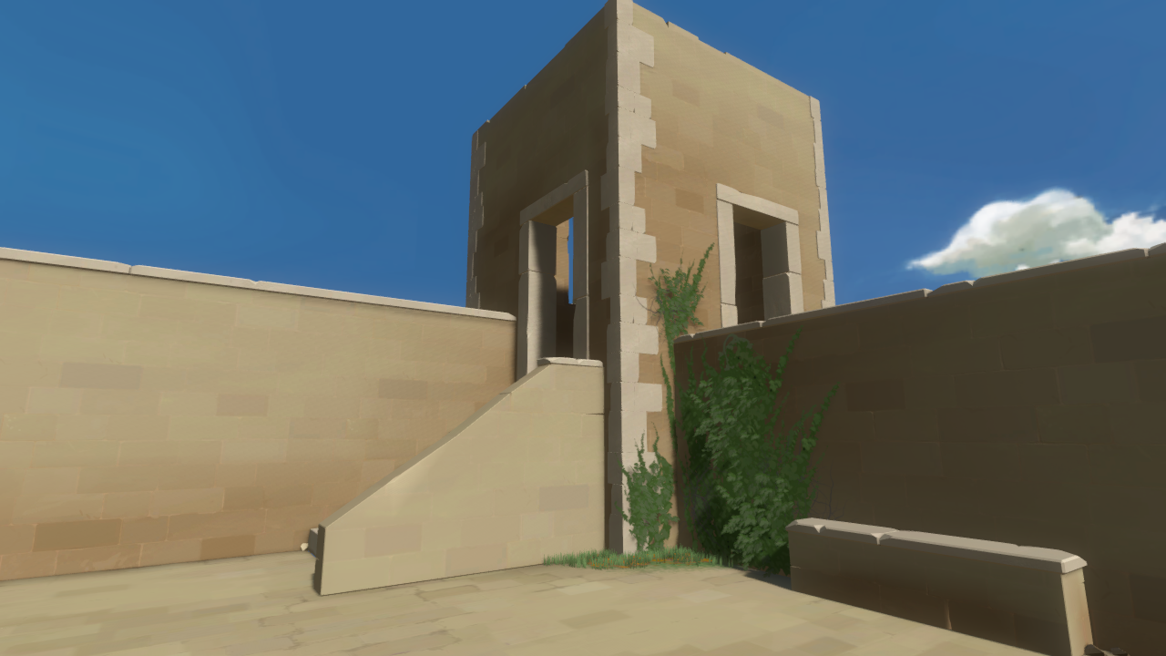
 And here is how the corner for the art test currently looks like:
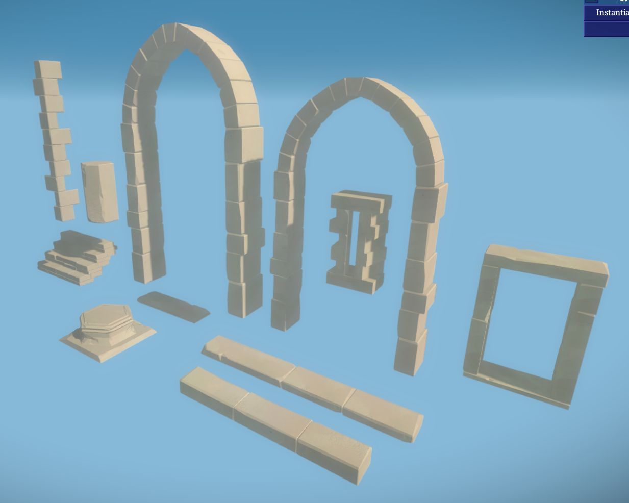
To make the process faster, I used a lot of modularity where I could. Door and window frames, stairs, arches, ledges, anything that would repeat at least a couple of times.
Also the fact that our textures are so clean and the lightmaps are per entity, it meant I could rotate the meshes to add quickly have variety. Here are some of them:
And other angles:
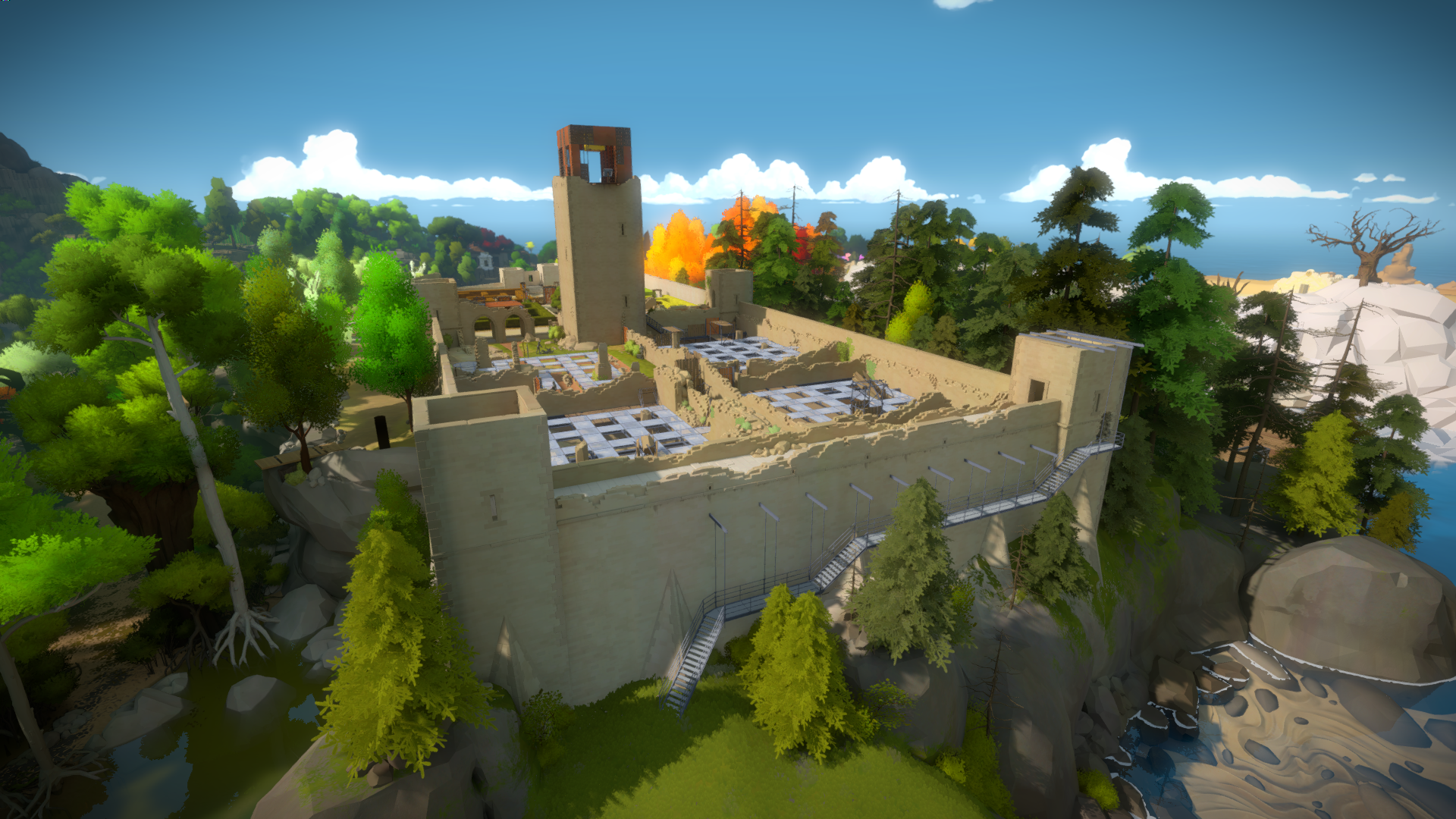
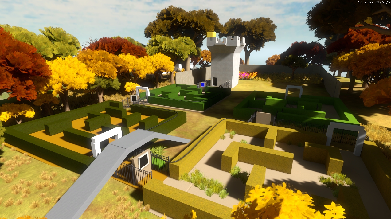
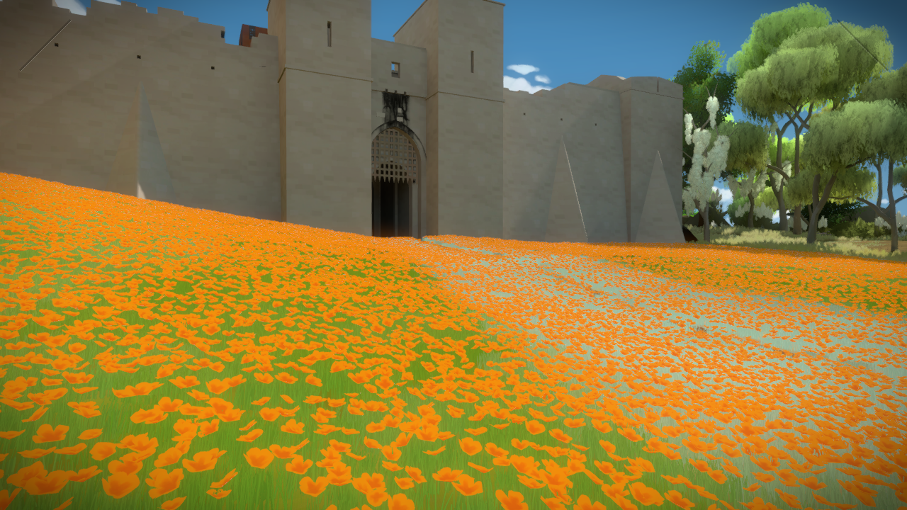
Keep Field
Worth a mention since this area had a lot of different ideas thrown at it. I won’t go over them but here are some screenshots that I captured during that process.
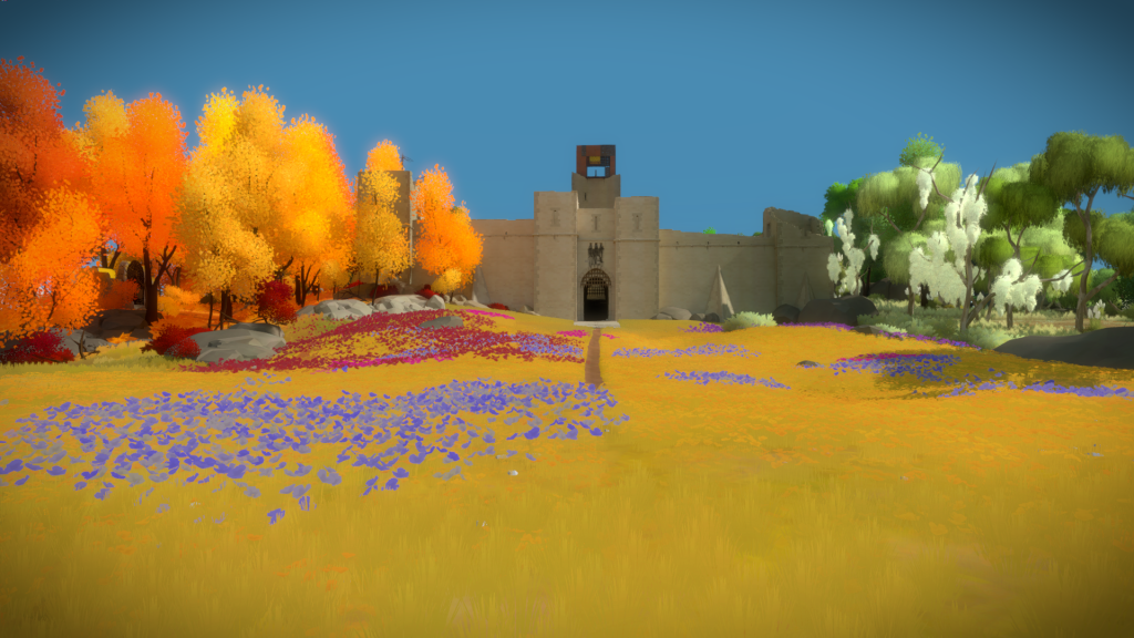
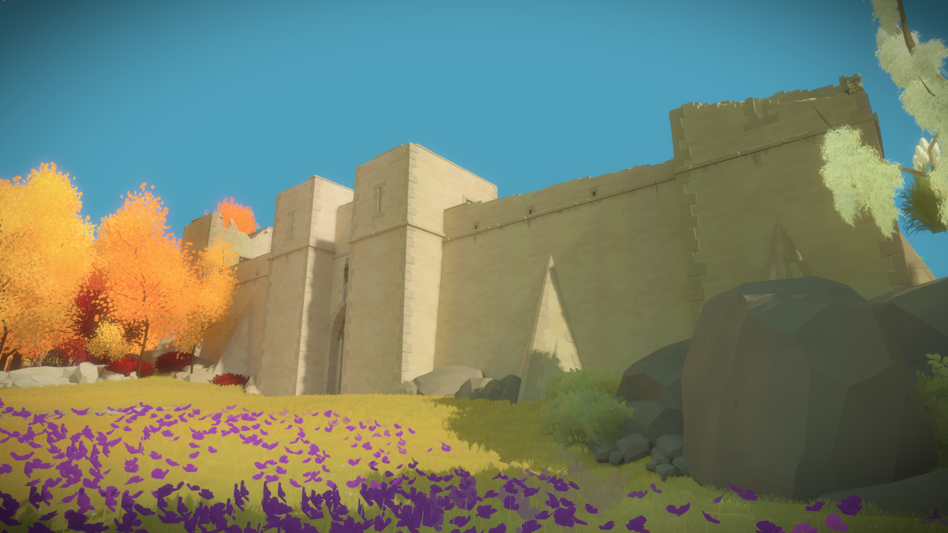
 And the final result. There are tons of interesting architectural details that most people won’t notice but will hopefully feel it. For example, in the image below, if you pay attention you will see that the terrain is uneven. That means that each tower has a slightly different heights, from the tallest on the left to the shortest on the right (which is also compensated when you are walking inside the building). The right side is also more ruined than the left side due to being more exposed.